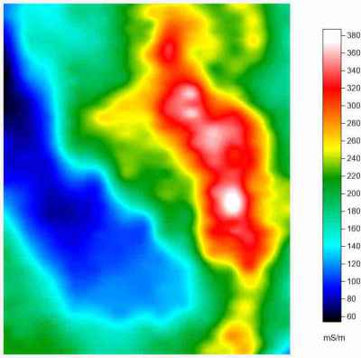
When the mapping software is allowed to control the creation of maps, forward modeling is used where the model fits the data and an image map is created. The limits of the data provide maximum delineation between areas of high and low conductivity and may delineate higher conductivity areas with more precision than contour maps. However, the fuzzy boundaries may make it difficult to determine the edges of the affected areas. Areas cannot be calculated from this type of map.
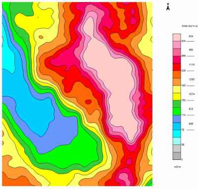
By controlling the mapping software, reverse modeling can be used where the data is made to fit a pre-built conductivity model resulting in a contour map. The scale of the model is greater than the data limits, but hard boundaries may make the map easier to interpret. The pre-built model tends to provide more detail in the background conductivity and less in the more heavily impacted areas, which reflects my soils based approach to data analysis. Areas can be calculated from this type of map for each coloured polygon, which can lead to easier interpretation of the data, including predictions of Electrical Conductivity (EC) values. PENSERV has been making maps like this for over 20 years.
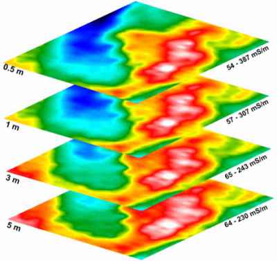
Multiple depths showing the change in conductivity with depth as an image map. In this set of maps, conductivity is highest in the most impacted areas at the surface and decreases in intensity with depth, as represented by the pink and red colours. While the limits of the data provide maximum delineation between areas of high and low conductivity, the maps all look very similar. You have to look at the range of data that each map uses to appreciate the differences in the maps and this is not an intuitive process. Thinking the maps are all the same may lead to faulty interpretation. Conversely, background conductivity, represented by the dark blue colour, is lowest at the surface and increases with depth. Only the low conductivity trends are displayed accurately by colour. The high conductivity trends need to be interpreted by the range of data the colours represent.
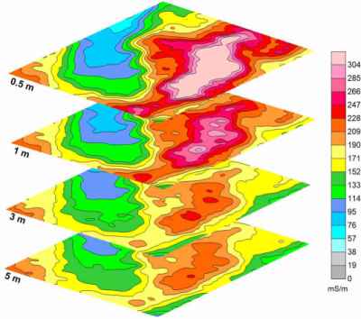
Multiple depths showing the change in conductivity with depth as a contour map. By using a common colour scale, differences between maps are more obvious. The higher conductivities represented by the pink and red colours can be seen visually to decrease in intensity and extent with depth, suggesting that the impacts are closer to the surface. It is more intuitive to assess the differences in conductivity with depth by relying on the colours and this leads to better interpretations in the relationship between soil conductivity and depth. Background soil conductivity is also lowest at the surface and gradually increases in intensity and depth with increasing depth. Both of these conductivity trends are displayed accurately by the colours on the maps. Additionally, the areas (not shown) calculated for each colour polygon can be used in volume estimates for the impacted regions.
