
Metallic or electrical interferences are a common problem with any electromagnetic technique and how these interferences are dealt with is critical to the interpretation of the data. While one approach may be to do nothing and just accept the interference, it is probably better to remove or transform the interfering data points. Removal of data is a time consuming process that can result in gaps in the data coverage, but it is a very effective strategy for point source interference, such as too close proximity to a steel object like a building, riser, or underground metallic structure.
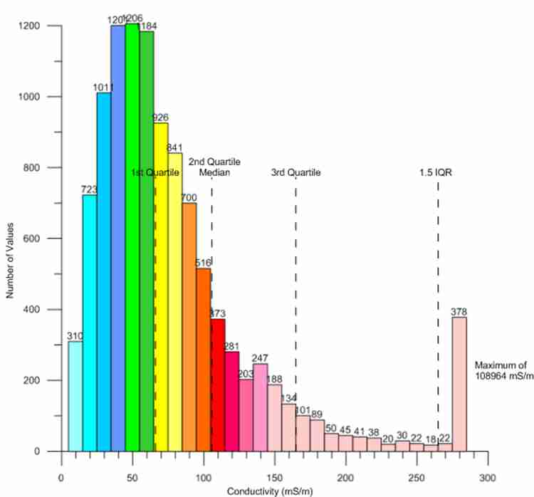
EM data typically has normal distribution, as shown in this histogram. The values close to zero end up being lumped together in one or two size classes and the values at the high end are more spread out. The problem is that when interferences are encountered on a site, they are typically in a single size class at the very high end of the histogram and greatly skew standard statistical analysis. The arithmetic mean and standard deviation metrics are rendered meaningless by such a distribution. In this case, the use of quartile statistics (median, first and third quartile) can be used very effectively. This technique is known as Tukey’s Rule for outliers and is defined as the median plus 1.5 times the interquartile range, which is the difference between the first and third quartile.
Tukey’s Rule does not exclude or remove data points. It simply sets an upper value for very high data points, thus transforming them to more reasonable values. As shown in this histogram, the limit of the median plus 1.5 x the interquartile range (IQR) would transform the very high anomalous values to more reasonable levels. PENSERV has instituted a sliding scale for the multiplier ranging from 0 to 9 to allow for more fine tuning in the transformation of very high data points, which in many cases is also combined with the removal of point source data.
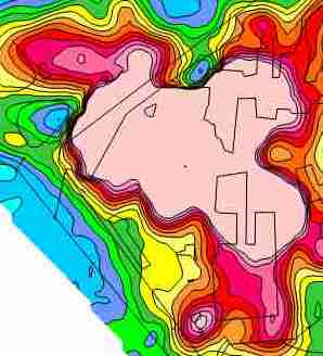
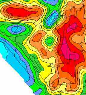
When the interferences result from buried or aboveground metallic structures and cathodic protection fields, the interference can be seen at all depths, but particularly at the lower 3 and 5 m depths, simply because the electromagnetic wavelengths are lower and spread out further vertically and horizontally from the conductivity sensor, thus encountering more potential interfering objects and fields. At this industrial facility, almost one entire portion of the facility was obscured by metallic and/or electrical interference from buildings, underground utilities and cathodic protection. The interference was so widespread that data removal was not a viable option.
At this site Tukey’s Rule for outliers was used to transform the very high interfering data to more reasonable values. The use of this technique becomes an iterative operation, starting with a weak multiplier of say, 2 or 3 and then increasing the strength of the multiplier until the result “looks” more realistic. In this regard, the multiple frequencies of the GEM2 take on added importance, because the results can be compared with the layers above or below the frequency/depth being transformed. For this site, a multiplier of 1.25 resulted in a conductivity map that was relatively free of interferences.
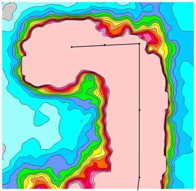
Interfering data resulting from purely electrical sources can be more problematic than data from metallic or mixed sources. Electrical interference typically affects only a single frequency/depth and for whatever reason, it seems the most severe interference often emanates from a single wire power line. In this case, the zone of electrical interference was almost 100 m wide. Tukey’s Rule was applied to this single frequency and a multiplier of 0.25 was used to reduce the anomalous values to more reasonable levels. The conductivity maps above and below this frequency/depth were used as an indicator of what a reasonable correction should look like.
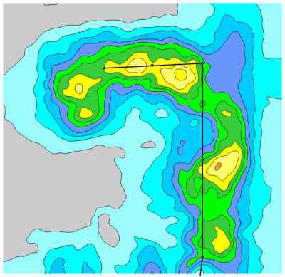
The use of Tukey’s Rule, as with any other technique, is simply another tool designed to aid in the interpretation of the data. Interpretation always has two parts, scientific and creative. The scientific portion is represented by the data. The creative portion is how the data is manipulated to aid in the understanding of trends in the data. There is always a balance to be maintained in interpretation, such that the creative portion does not outweigh the scientific portion, but when used strategically the interpretation can greatly aid in the understanding of the data.

